
A end to end application aiding in the reduction of manufacturing waste by enhancing the user's try-on experience.
HIGH LEVEL TIMELINE
4 Week Sprint
MAKE OF THE TEAM
I acted as the sole user experience / interface designer.
KEY GOAL
To develop a new web-based application that tailoring the moving experience.
.png)
.png)
THE PROBLEM
Many individuals move to new locations whether international or nationally struggling to figure out the most desirable place to live based on their priorities.
According to recent data, approximately 10-15% of the US population moves each year, which translates to roughly 30 million Americans relocating annually; however, this number can vary depending on the year and region.
MY ROLE
As the sole user experience researcher and user interface designer; I was in charge of identifying and aligning the target consumer's stressors with the industry goals.
As an individual who has moved multiple times to different parts of the United States, as well as different major cities. I understand the weight of trying to find a place to live in a new location not knowing the relative proximity the house will be to the things you truly care about.
To understand individuals needs during the moving process, as it relates to property selection. In an effort to determine the best features to add to the web design.
GOALS & OBJECTIVES
To better understand what individuals need during the moving process, we first need to determine what kind of people are moving and why. ie (work relocation, social reasons).
Secondly, narrowing down the objective of creating a web-enabled application by focusing solely on individuals who are moving to a major city.

THE USER
For research and design purpose, I will be focusing on young professionals between the ages of 18-45.
Focusing on young professionals from the start of their careers to the mid-point allows me to generally understand who is moving. Learning more about what is influencing the user's decisions when selecting a long term / short term property to call home.
BREAKING DOWM THE PROCESS
To start, I must try to understand why individuals are moving, which would lead to the following questions of what are they looking for when trying to find a place to call their next home.
After identifying the users Nestle would target from a user influence perspective, I decided to speak with 5 individuals about their experiences of relocating to new cities to better understand what are factors they consider when selecting the next house or city. This in the end will help assist with the conceptualization and design of Nestle. Ensuring I am created a product that is meeting the needs of the user.
Listening to our user's stressors when finding the right place or city to move to had me wonder, what are other competitors solutions to these exact concerns. Diving into a competitor analysis to understand what products were out there for young professionals and how Nestle can contribute something unexpected and new for our user.
THESE WERE SOME MAJOR LEARNINGS OR POINTS WE WANTED TO CALL OUT
Reason for Moving
Majority of the individuals I have spoken to have stated that they have relocated due to personal reasons. Whether that be a relationship, acceptance of a new job, or just wanting a change.
Current Online Tools
Young professionals tend to stick to sites that are advertised or social used. Such as Zillow, Apartments.com; Compared to other competitors such as Niche allowing users to easily filter out unwanted properties, Areavibes providing statistical data to users & lastly Livability which shares quantitative and qualitative data sourced by the goverment.
Proximity
In speaking with individuals who have moved in the past whether for a job relocation or a personal reason. It was clear that the user is influenced heavily by the proximity on their new location as it relates to: the office, public transit, highway entrances & the social scene.
Cost
Users are concerned about the price of their new house/apt. As many young professionals staying with in a budget is something they are influenced by.
Safety & Security
Users also emphasized the importance of feeling safe and secure in their new surroundings. One individual stating having visibility to crime rate in the area is a plus when review properties.

THE PERSONAS

Christina Wright
Business Analyst
Needs
-
Understanding of Social Scene
-
Public Transportation Navigator
-
Movers to help with the process
-
Safety Radar
Christina is a passionate 25 year old professional from Chicago Illinois, with an MBA, who is looking to build a community within the new city she calls home.
Motivation
-
Wants to move to a place with a vibrant social scene
-
Wants to be close to public transportation, easing the commute
-
Find a reliable moving company to help unpack and sort through belonging.
Pain Points
-
Frustrations with the walkability to and from restaurants an bars
-
Does not feel safe in her current neighborhood
-
Lacks social establishment in her new city.

Jack Flanagan
Software Engineer
Needs
-
List of local social entertainment and gatherings
-
A understanding of safety levels
-
total cost calculator
-
assistance d-cluttering while moving
Jack is a 28 year old professional who is looking to increase his social network while maintaining his distance to his office.
Motivation
-
Wants to move to an area that is safer than his current neighborhood
-
He is looking to save on the cost of rent
-
Wants to still be a commutable distance to the social scene and his job.
Pain Points
-
Frustrations with his commute to the office due to traffic
-
Lacks a social network, making him less than eager to join the community
-
Struggles to d-clutter and discard items during the moving process
UNDERSTANDING THE USER
The research conducted through interviews and competitor analysis have lead me to better understanding of the user. Reflected through our personas Jack & Christina. Both Jack and Christina are in search of resources to help them find neighborhoods matching their key criteria. The individuals are looking for up to date information about the neighborhoods and properties. As well as needing help finding affordable solutions for the moving process.
Leading to the questions of:
1. How might we help young professionals moving to a new city have the resources to find a neighborhood that matches their criteria.
2. How might we aid young professionals receive transparency about properties / neighborhoods.
3.How might we aid young professionals seeking our affordable moving solutions.

THE FEATURES
As I continuing to think about what would not only make Nestle standout from competitors in the market but also appealing to Jack & Christina. I identified 3 core features that would not only assist Jack & Christina in achieving their goals.
Personalized Reccomendations
Nestle users will have the ability to view personalized recommendations as the site continues to learn what the user is most interested in when looking at neighborhoods and properties. Allowing the user a more personalized experience compared to competitors.
Interactive Map
Reviewing my user interviews, it was interesting to see that users are drawn to Zillow & Apartments.com because of the offering of an interactive map. Going one step further, Nestle will have an interactive map that reflects criteria that is important to the user.
Cost of Living Calculator
In the user interviews and Christina & Jack's need, I understand the importance of budgeting and wanting to be conscious of spending. Adding a cost of living calculator will allow users to explore the cost to live in different neighborhoods around a city.
FEATURE PRIORITIES
After understanding the key features that will allow us to compete with competitors like Zillow & Apartments.com, it was important for me to understand how important each of these features would be to have at initial launch for users.
Urgent
Important
-
Account Creation
-
Account Settings
-
Interactive Map
-
Filtered Search
-
Neighborhood Descriptions
Not Important
-
Asset GPS Tracking
-
Location Updates
-
Location Reviews
-
Social Dashboard
Not Urgent
-
User Application Submission
-
Moving Support
-
3rd Party Additives
THE FLOW
After the key features are determined to help Nestle compete with competitors, influenced by our persona's needs & motivations. It is time to understand how our user will navigate our mobile app. From logging onto the app for the first time to checking out with a cart filled with product.

THE WIREFRAMES
Once I aligned on the flow our persona Joey would need to take to find items he is looking for; try them on and potentially purchase it was time to start bringing these ideas to life.


.png)
After creating the initial wireframes, it was important to assess how to clean up the wireframes prior to bringing them into user testing.
NEXT STEPS
Taking these low fidelity wireframes adding in additional imagery & icons to allow the user to easily understand the websites purpose and assist in navigating through the tasks being asked of them.
ie. searching for a property using the information given or searching for a new neighborhood with the information given.
HIGH-FI USER TESTING
To better understand the acceptance of a new relocation website, I asked the 5 individuals who I spoke with earlier on for user interviews to test out a high fidelity prototype.
Success Metrics
-
Task Completion: Were the participants able to successfully complete the task? Was there anything preventing them from completing the task? How many clicks did it take the user to accomplish the task?
-
Ease of Use: Is the product intuitive and well-organized? Were participants able to find the information they needed? Was anything misleading or confusing?
-
Qualitative: How did the participants feel using the product? How did they react to the overall aesthetic of the product?
The Results
-
All participants noted the process for finding a neighborhood very easy.
-
Users spoke to the appeal of the overall design.
-
Noted the excitement and importance of an interactive Map.
-
50% of testers however spoke to having trouble navigating through the site.
-
Looking for an easier way to return back to prior screen.
-
-
2 users spoke to the busyness of the homescreen.
THE UPDATES
Taking user feedback and the results from user testing into consideration, I revisited the overall design of the product. Prioritizing updates that would not only ease confusion around navigation but make the product more appealing from a cleanliness standpoint.
Increased Logo Scale
.png)

75% of users had a better reaction to the blue color scheme

.png)
Added a breadcrumb trail to ease user's navigation
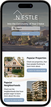
THE FINAL PRODUCT
.png)
Listening to the user and ensuring the product aligns with not only the business goals Nestle has in place, but also ensuring my persona's needs and frustrations are being met with this site. I have landed on the final mobile-site version of Nestle.
.png)

.png)
.png)
These are just a few of the several screens designed for Nestle. To see all of the screens and how they interacted with one another for the user's ease feel free to try out the prototype.
.png)
TITLE OF THE CALLOUT BLOCK
LESSONS LEARNED
I think it is always important to test your prototypes at least twice a long the journey of design if you can. I would have saved a lot more time with this project if I asked users about color scheme prior to making it to final stages.
As we continue to learn about our users and develop the site further, I think we should consider the additional features that are needed for the site. This project has the ability to grow and develop not only from a UX perspective; but from a way to relieve stressors involving moving to a new area.
Let’s take a step back and open up further research of our users and their stressors, casting a wider net of personnel to further understand the key areas of success Nestle needs to grow and develop.